Case Study: Impact of Corona Virus COVID-19 on Public Transport Delay
Work Led by Dr Yuming Ou inside the Future Mobility Lab (www.fmlab.org) at UTS
15 April 2020
Over the last month, the COVID-19 pandemic has significantly impacted people's travel behaviours due to stay-at-home and travel restrictions; this reduced the overall traffic congestion in the central urban areas which are usually affected by major delays on all transport modes, especially during morning/afternoon peak hours. Findings reveal a significant drop in bus stop delays in March 2020 around Eastern and central suburbs in Sydney, Australia, reaching even 9.5 minutes lower records during the afternoon peak hour.
Set-up
With the COVID-19 pandemic imposing travel restrictions around all cities in Australia, our team in the Future Mobility Lab at the
University of Technology Sydney has studied the effects of the pandemic on the bus delay accumulated in the Sydney metropolitan region,
with the purpose of analysing how major events impact the public transport infrastructure.
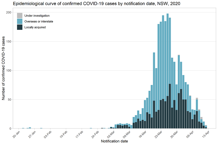
The following chart reflects the epidemiological curve of confirmed COVID-19 cases in NSW showing a significant increase in March this year compared to the previous month, which influenced our decision of conducting our big-data analytics on the period of February-March 2020; this means that current results are reported before the rapid increase of confirmed cases (February 2020) and after the rapid increase of confirmed cases (March 2020).
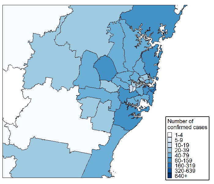
After the time-period was fixed, we proceeded at investigating the entire Sydney region, with the purpose of first understanding which are some of the most affected areas and which have been less impacted by the new travel restrictions. The following graph shows the map of confirmed cases in Sydney metropolitan region, with a larger concentration of cases around the central and eastern suburbs, where majority of business and transport interchange hubs are located.
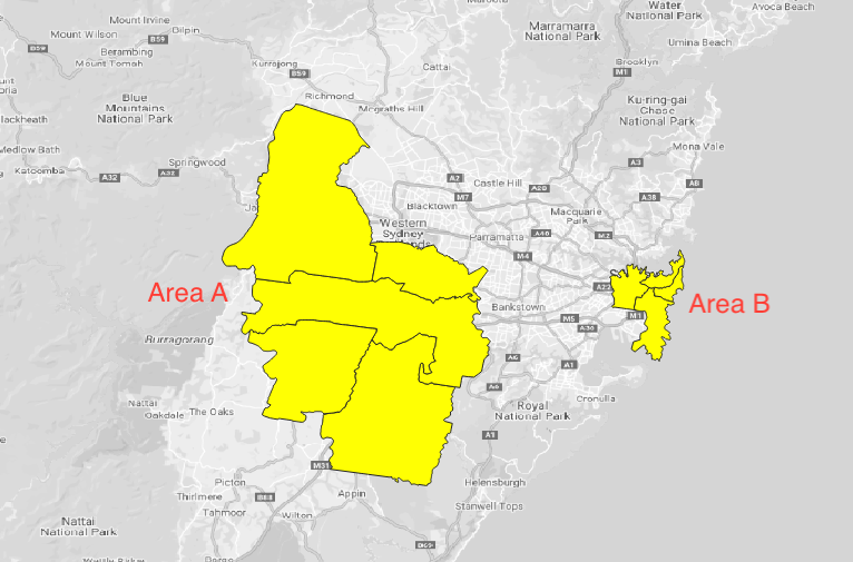
Therefore, our case study focused on two different areas in the Sydney region, as shown in the map below, segmented using the Local Government Areas (LGA), which have been chosen strategically due to their different travel behaviour and reported infection rates. Area A on the right hand side includes the Western City LGAs where traffic is more remote and reported cases of COVID-19 infections are lower, while Area B on the left side includes Sydney CBD and Eastern suburbs, very popular locations for business, travelling, transport multi-modals hubs and tourism attractions due to proximity to beaches; this area reported the highest number of COVID-19 cases according to NSW Health official online reports.
Data Sources for Bus Delay:
the current study has been conducted using free public transport data sources available on the
Open Data Hub of Transport
for New South Wales. This includes both dynamic timetables information, together with real-time tracking of bus movements across the city,
which have been crawled, aggregated and stored for statistical investigation purposes for several years.
Findings
The following charts show the bus delay statistics on areas A and B in February and March respectively including: the median bus delay from
5 AM to 10 PM, the 5th and the 95th percentiles of this accumulated delay across all bus stops. Blue lines stand for the delay
in February 2020 and red lines stand for the delay in March 2020. It can be observed that the change of the bus service performance was more
significant in area B than in area A, especially in the upper bound of delay in peak hours. The overall average decrease of delay was 4.4 minutes (36%)
in area B while 1.3 minutes (15%) in area A in peak hours (7am-9am and 4pm-6:30pm). This observation might imply that due to the COVID-19 pandemic in March,
people tended to work from home and avoid unnecessary travel which significantly reduced both the traffic congestion and public transport delay
in urban-centre areas. This has significant positive benefit for regular bus operations and could be used as a benchmark for traffic improvement
when the situation will return to normal traffic conditions.
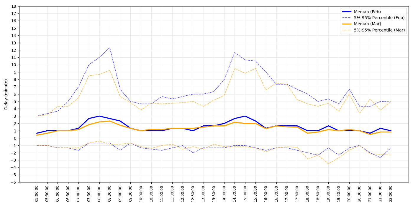
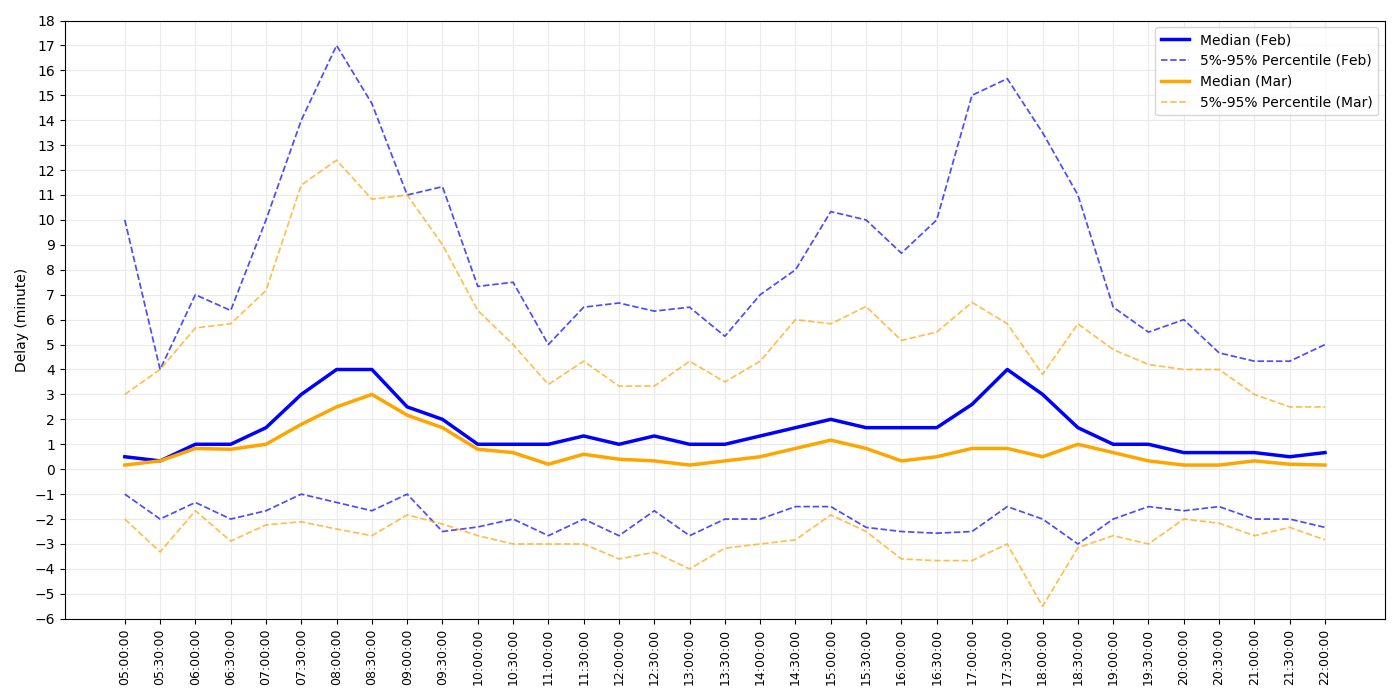
Even more, the results indicate that there is a significant improvement of bus network servicing across the Eastern and central suburbs in Sydney which can reach even an 9.5-minute delay reduction around afternoon peak hour (17:00). However the Western Sydney suburbs tend to maintain the same level of bus delay despite the new conditions, proving that traffic in this area is less impacted by traffic congestion, and more impacted by service design or by the economic and business profile of the area.
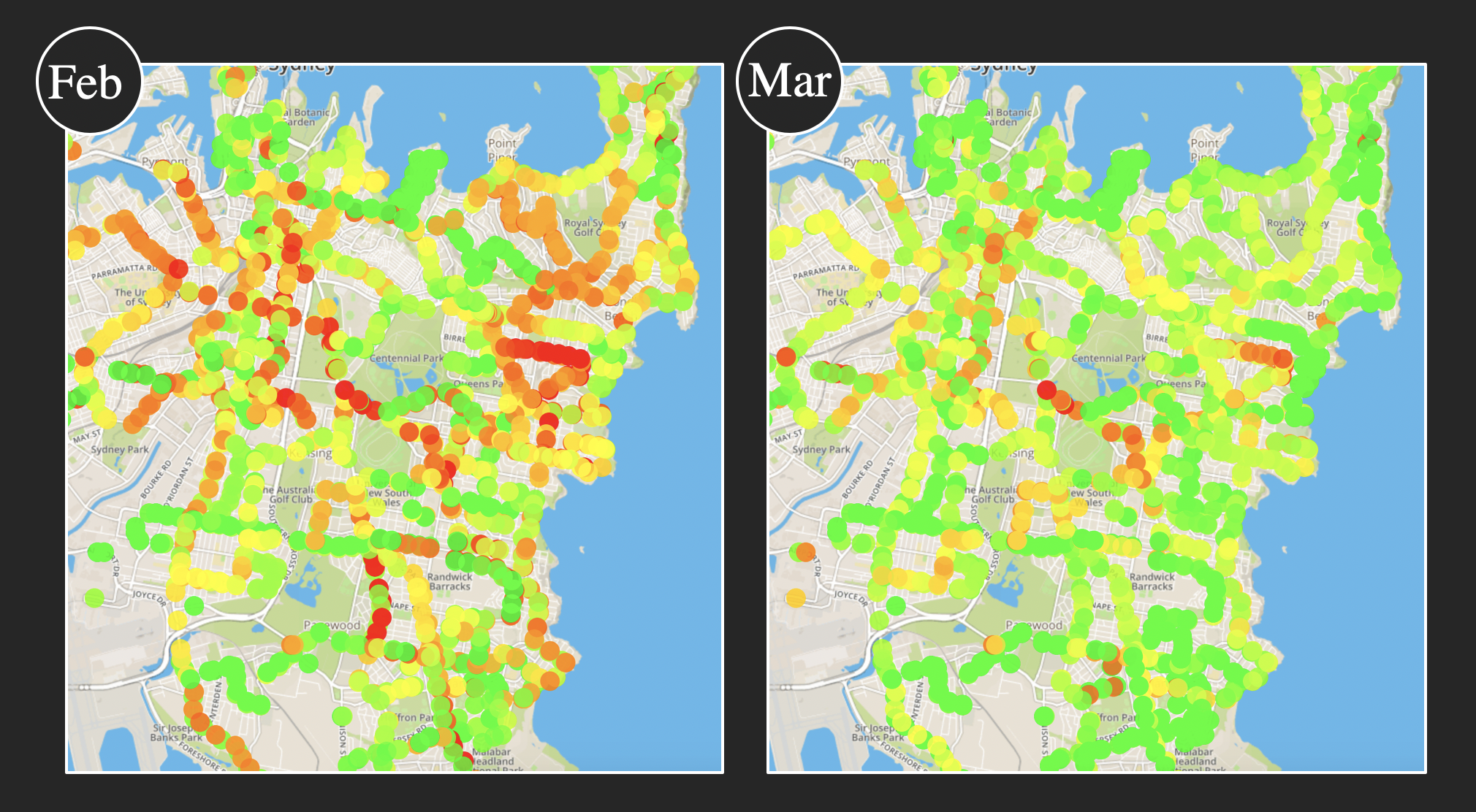
The following graph shows the delay heat map for area B in morning peak hours of February and March. Each dot in the map stands for a bus stop. Green colour means smaller delay (buses arriving on time) while red colour means larger delay (buses being always late). Once again the investigation revealed significant improvement across majority of bus stops in terms of delay and a better bus service overall.